
Today I logged into a new AdWords account I was helping a friend with (very small spend) and was greeted with the brand-new Google AdWords Alpha UI design. This was surprising to me, but to my knowledge no one else has posted screenshots and shown the various menus and other items in the new UI. To date, all of the screenshots I have seen have been from both Google’s teaser posts and their on-stage announcements earlier last month (May 2016). I did not have to sign any documents or signup for any betas to access the new AdWords — it was just here when I logged in.
When logging in, here’s what I was greeted with (never logged into this account before, got an MCC link last week).

In the main overview view, a lot has changed. Down the left side, Google has added what were once tabs for much of the interface on the top. Google is showing Opportunities now very clearly on the top-left instead of having it be on the top like before. Next up is Campaigns, Ad Groups, Ads & Extensions, Keywords, Settings, Locations, Ad schedules, Devices and Change History.

New to the overview screen was the devices area, which shows the breakdown of cost, impressions and clicks per device. Shown here is the long-awaited for tablet segment where you can change bid amounts now for desktop, tablet and mobile searches. Also here of course is the new Material Design framework, showing a clean minimal line graph for clicks and impressions. Clicking on each of the headings shows that metric on the chart in the overview menu.

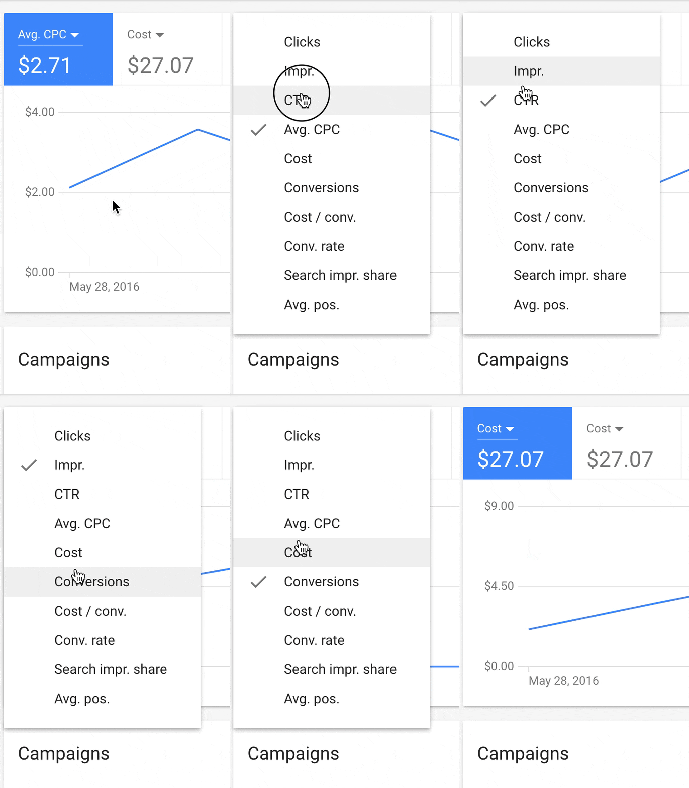
The new interface is fast. Even in Alpha, I can tell that clicking the menu to switch between clicks, impressions, costs and more is crazy-quick. Instead of the current AdWords “lag” that seems to come up currently, the new line charts swap out metrics almost instantaneously.
Opportunities were not yet ready in the current Alpha: Google encouraged me to go back into the old interface and use Opportunities there.
Another area that was not added yet was Change History, however this was not made as updated as the rest of the UI yet and just had a simple call-to-action link to go to the current AdWords design.

Lastly, where settings was perviously in Google AdWords, you’ll see the new briefcase icon that has many of the same functions that we’re used to with the current version. However, it has been simplified in terms of design and with a small indicator to let you know that you’re opening these areas in a new tab.
What do you think? Personally, after using this for a bit, I felt much less confused and was starting to really like it. Just in terms of overall speed of use, I think this will be a great update. While many of the more advanced features were not ported over yet to the new Alpha, I’m sure it’s just a matter of time before they are.
Update: new screenshots added for keywords and the ads interface requested via James Svoboda on Twitter.


Let me know your thoughts on Twitter — or if you want screenshots of another area of the interface.
